Cure LBSL :
Branding Redesign
About the client
Cure LBSL initially emerged under the banner of "A Cure for Ellie," driven by the urgent mission of locating life-saving medical interventions for Ellie, an 8-year-old grappling with the debilitating effects of LBSL, a degenerative muscular disease. Over time, this initiative expanded its outreach, spreading vital information and resonating with numerous families who were navigating the same journey as Ellie and her loved ones. A tight-knit community formed of individuals seeking answers and medical guidance related to this challenging condition. As the community continued to grow, it became abundantly evident that the cause extended far beyond Ellie's individual struggle, and the organization held the potential to provide invaluable support to countless individuals and families facing similar trials.
We were tasked with transforming the organization's digital presence. This included a comprehensive website redesign aimed at infusing it with a fresh and inclusive appeal. We spearheaded a rebranding initiative, which involved a strategic name change and an overhaul of the organization's logo. Additionally, we orchestrated the development of an SEO (search engine optimization) strategy to enhance the website's discoverability and reach. We also explored avenues to streamline website navigation, ensuring a seamless user experience that facilitates intuitive information retrieval, volunteer engagement, and streamlined donation processes.
This case study focuses on the branding redesign of the organization, with an emphasis on the process of organization renaming and the development of a distinctive visual identity and logo.
Objective
Problem
Deliverables
Role
Cure LBSL, initially founded as "A Cure for Ellie", has evolved into a community-driven initiative serving numerous families. The organization faces the challenge of rebranding and restructuring its digital presence. The problem at hand is to redefine the organization's identity, create an inclusive and informative website, and establish a clear brand message that resonates with a broader audience while ensuring seamless navigation and accessibility for users seeking information, volunteer opportunities, and donation pathways.
The organization’s digital presence and brand identity needed a comprehensive transformation to align with its evolving mission.
Consultation with the client, user testing with board members and donors, rebranding strategy, logo redesign, updating the information architecture, SEO optimization strategy, and website redesign.
UX Designer, Graphic Designer, and UX Researcher
Client Consultation
Our aim was to look into the organization's core beliefs, understand its objectives, identify strengths, and pinpoint the challenges they encountered with their existing website. We had the privilege of engaging in a conversation with Beth and Michael, the dedicated parents and founders of the organization, to gain valuable insights into their requirements for this redesign.
Goals:
Rebrand to be more inclusive of all ages, genders, and different faces of LBSL
Due to most LBSL patients being diagnosed as young children, the site should find a balance between professionalism and youthfulness
Build trust with visitors of the site by conveying legitimacy and credibility
Growing and expanding the user base as well as attracting corporate donors
What’s working:
Community building
Providing hard-to-find information and resources all in one place to its users
Responsiveness and initiative of the organization
Providing a compelling story to rally behind
What needs improvement:
Process improvement on how to update the website - their current system is not very intuitive
SEO strategy
An inclusive brand identity encapsulating the LBLS community
Improved information architecture
Lacking information about how the donations are spent and current goals of the organization
Board Member / Donor Interviews and User Testing
We interviewed board members and donors of the organization to uncover any user pain points. We asked them questions about the organization’s branding and how they thought their image was evolving. They also walked us through a couple of simple tasks with us on the website so we could get some insights on what needed improvements.
Pain points included:
Crowding on the home page makes it difficult to navigate
Confusion about where the money is going and what impact it will have
Does not effectively communicate the story of what the organization is doing
The homepage lacks a clear call to action
Confusing website navigation
The donation page is outdated
Positive feedback:
Meaningful imagery helped to tell the story
Impactful story that makes readers want to donate
Liked that they could see what was going on with clinical trials, they noted that this information is hard to find anywhere else
Developing Personas
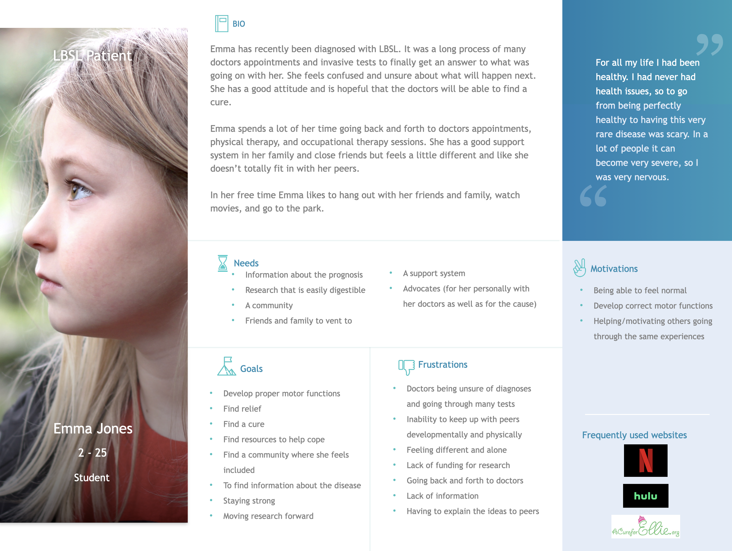
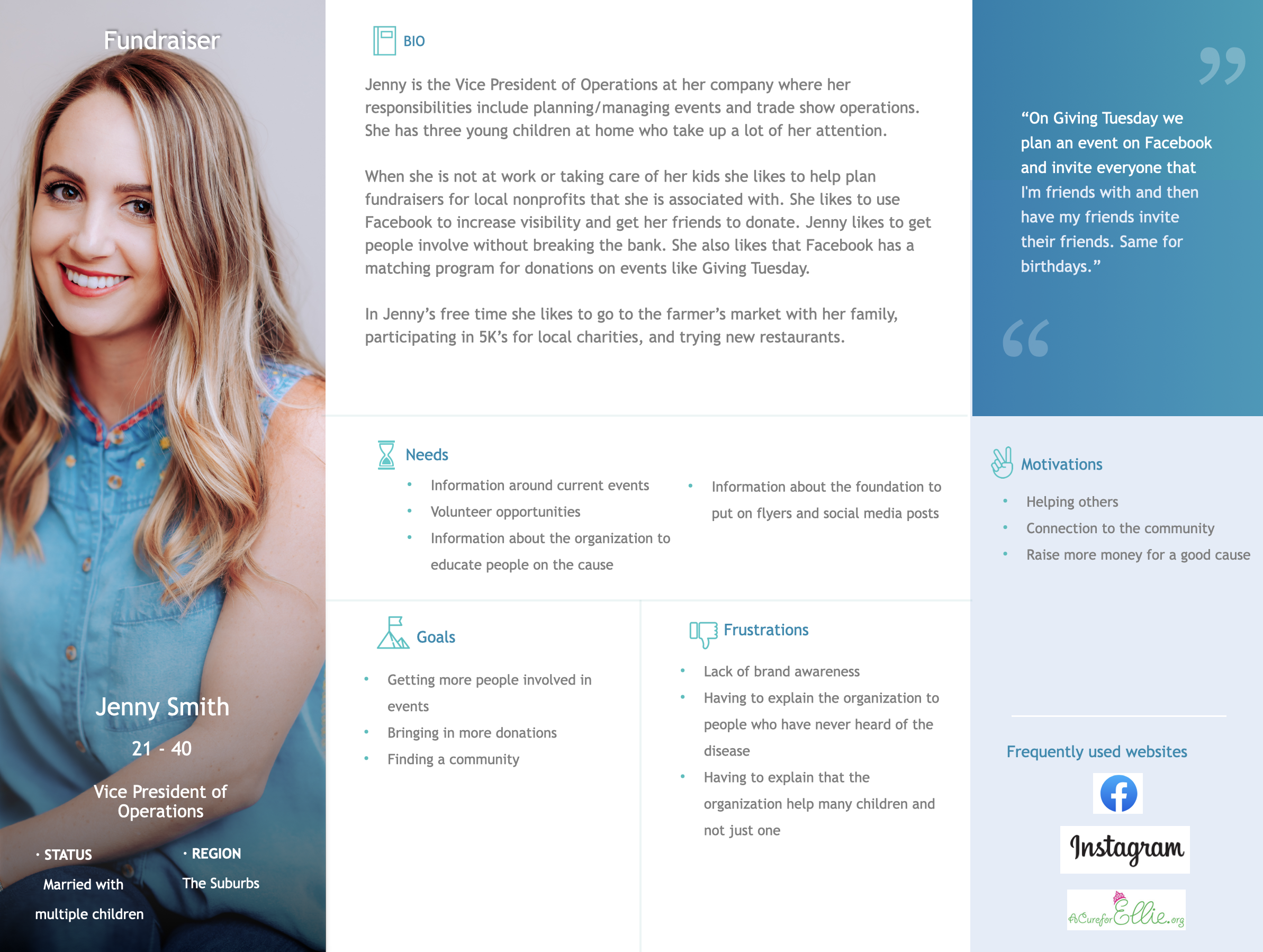
Based on the interviews with Beth and Michael and the users of the website, we we able to develop personas to keep the users in mind when redesigning the website and conceptualizing a new brand image.
Parent of a newly diagnosed LBSL Patient
LBSL Patient
Donor
Fundraiser
Mission Statement:
“Find a cure for LBSL, advance awareness of the disease, and support patients, families, and medical providers confronted with this ultra-rare condition.”
Data to Inform the Name Change
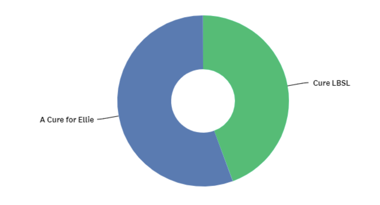
When asked about what name they would most likely donate to:
55% of participants said they were more likely to donate to the name “A Cure for Ellie”
44% of participants said they were more likely to donate to the name “Cure LBSL”
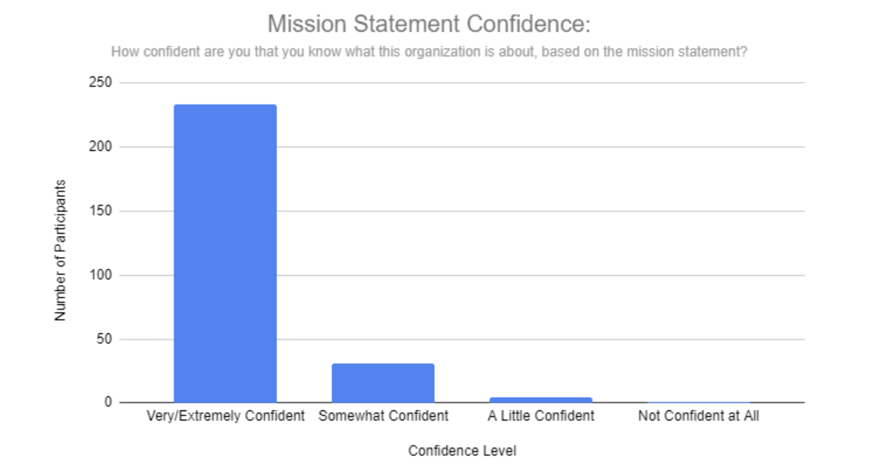
When shown the mission statement and asked about how confident they are that they know what the organization is about:
84% of participants said that they were very confident or extremely confident that they understood what the organization did based solely on the mission statement
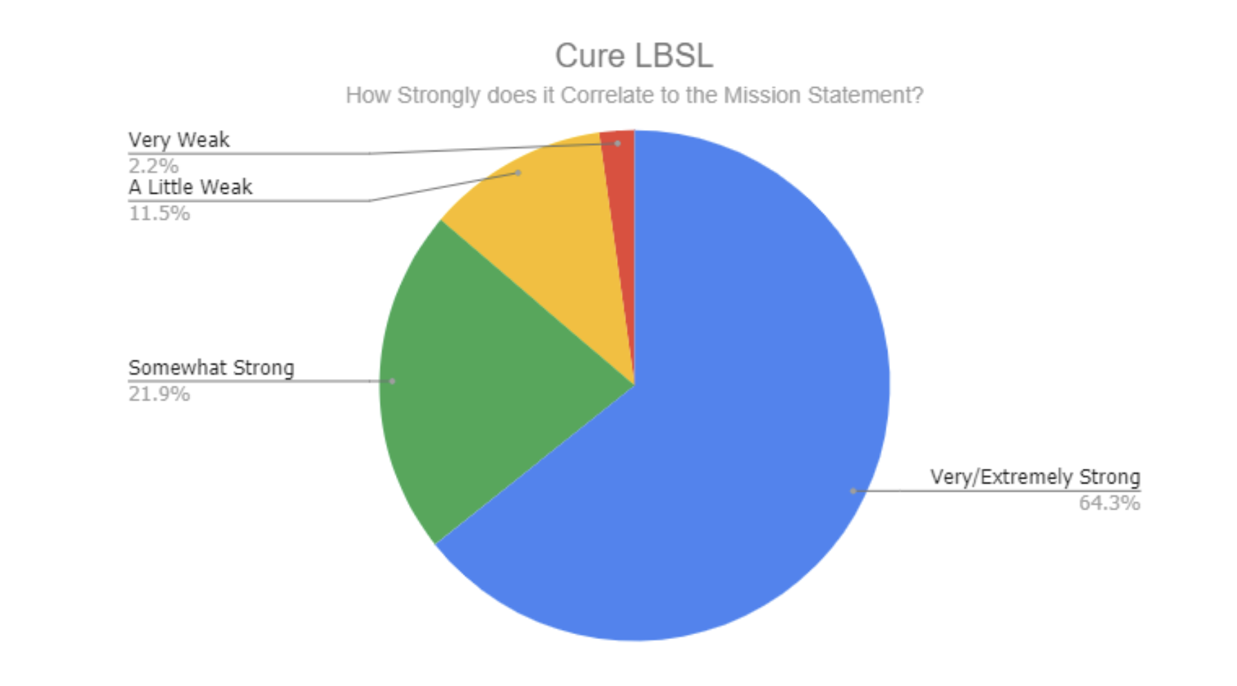
When asked how strongly the name correlates with the mission statement:
64% of participants said the name “Cure LBSL” very/extremely strongly correlated with the mission statement
Only 27% of participants said the name “Cure LBSL” very/extremely strongly correlated with the mission statement
Branding Survey Insights
We created a survey to get more information about the current brand perceptions. It was sent out to people likely to donate to a nonprofit and we were able to analyze data from 275 participants.
Results and Recommendations About the Name Change
Reasons to change the name to Cure LBSL:
It’s more inclusive
People with LBSL do not have to explain that the organization helps all those with LBSL
Cure LBSL correlates more strongly with the mission
The name Cure LBSL gives more room for the organization to expand and grow
Reasons to keep the name A Cure for Ellie:
People are more likely to donate if they know their money will impact someone they know
People already know the organization as such
Ellie has been the face of the organization
Recommendation:
Based on the statistics and insights from our interviews, our recommendation is to change the name to Cure LBSL. This name correlates 37% more strongly to the organization’s mission and allows for expansion, widening the user base. We also found that 99% of those surveyed said that they donate based on personal connection to the charity or overall cause that the charity is working towards, not because of the name.
Logo Interpretations
Participants rated the logo as more:
Childish, rather than mature
Feminine, rather than masculine
Approachable, rather than imposing
Fun, rather than serious
Casual, rather than professional
Safe, rather than extreme
Survey Results on Current Brand Perceptions
Brand Association Word Cloud
Thoughts about the current color pallet:
Positive associations included:
Little girl, happy, spring
Innocent, playful, bright, outgoing
Fun, special, attention-grabbing
Negative associations included:
“Ugly 1990’s Barbie”
Pink = Breast Cancer
“No… Not impressed… Those colors do not belong together”
Ideal Brand
The updated brand should move towards:
Less childish and more timeless. People of all ages should be able to relate to the branding and logo designs.
Less overtly feminine, more androgynous.
Find a balance between youthfulness and professionalism, without being stale or too corporate.
Brand colors should remain bright. Interviews confirmed people are drawn to vibrant and joyful colors.
Comparative Analysis
We wanted to learn more about how other organizations similar to A Cure for Ellie portrayed themselves and how they displayed important information to their users. To find out more we did a comparative analysis of 4 organizations either in the rare disease space/geared towards children with rare conditions.
Key findings included:
Content needs to tell a story that drives a targeted mission.
It’s important to have visible opportunities to volunteer and donate. Any call to action should be obvious and intuitive to the user.
Information should be easy to find and not overly complicated so that the users can find the information that they need quickly.
It is important that users know where donations are going and what impact they will have. It is important that this information is clear and is incorporated into the overall story of the organization.
Color Story and Style Tiles
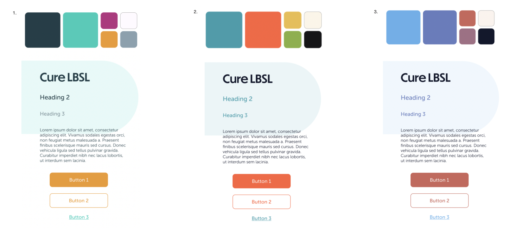
We took inspiration from the websites we looked at in the comparative analysis as well as incorporating the data that we gathered from the branding survey to come up with a color story for the website.
The branding survey showed that people liked bright and hopeful colors. We also wanted to keep in mind the original color pallet and riff off of the green and pink that they are currently using, but make it a bit more mature.
We showed these concepts to the client and we decided that the first concept fit the brand identity best.
Logo Conceptulization
Mind Mapping
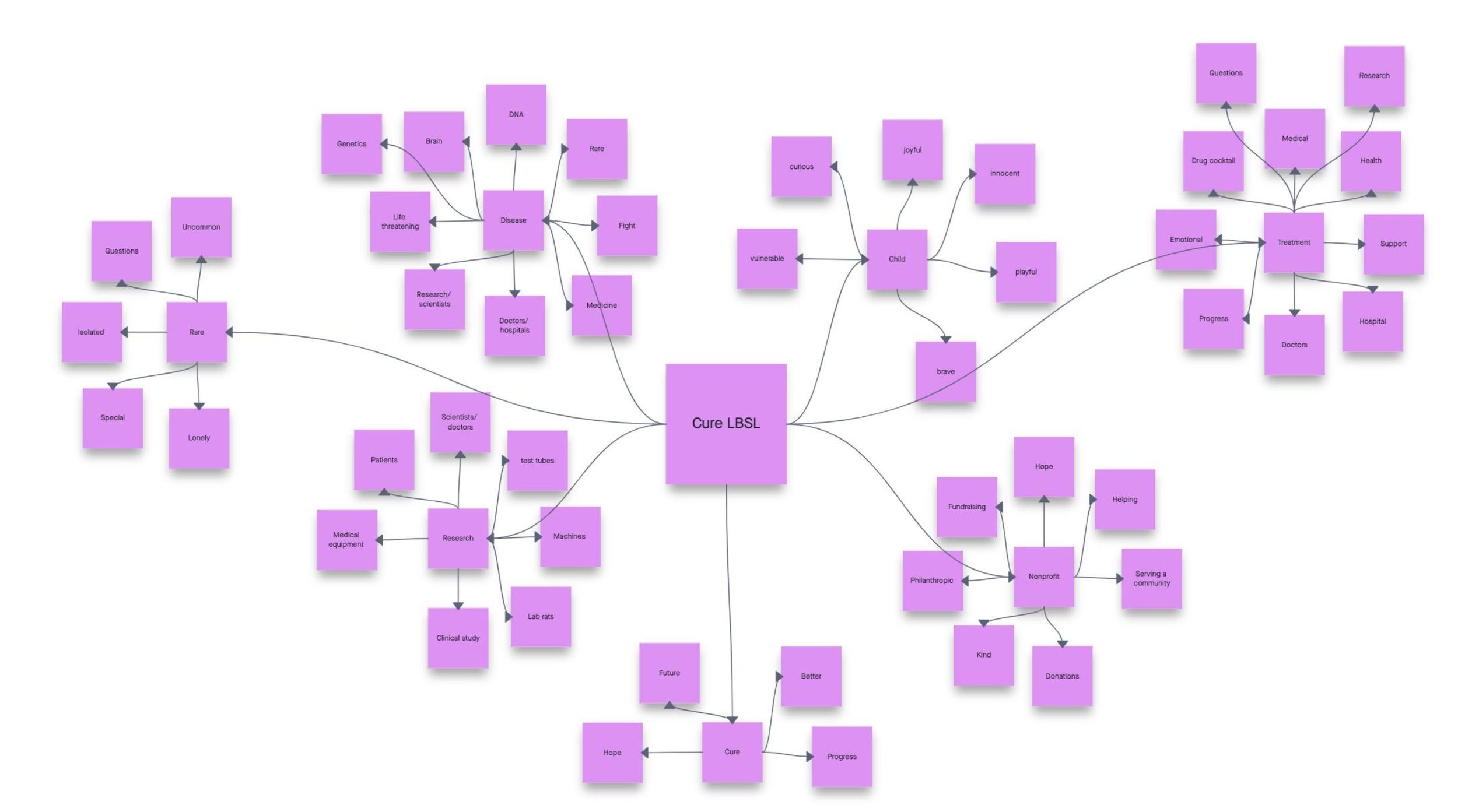
Before we jumped into designing the logo, we first wanted to brainstorm words that strongly associated themselves with the brand and words that the client and users of the website said they would like the brand to encapsulate.
We did this by mind mapping and organizing the words into different groups. To wrap everything up we mapped out key qualities and highlighted the words that described the brand that we were trying to achieve.
Key Qualities
Logo Design Process
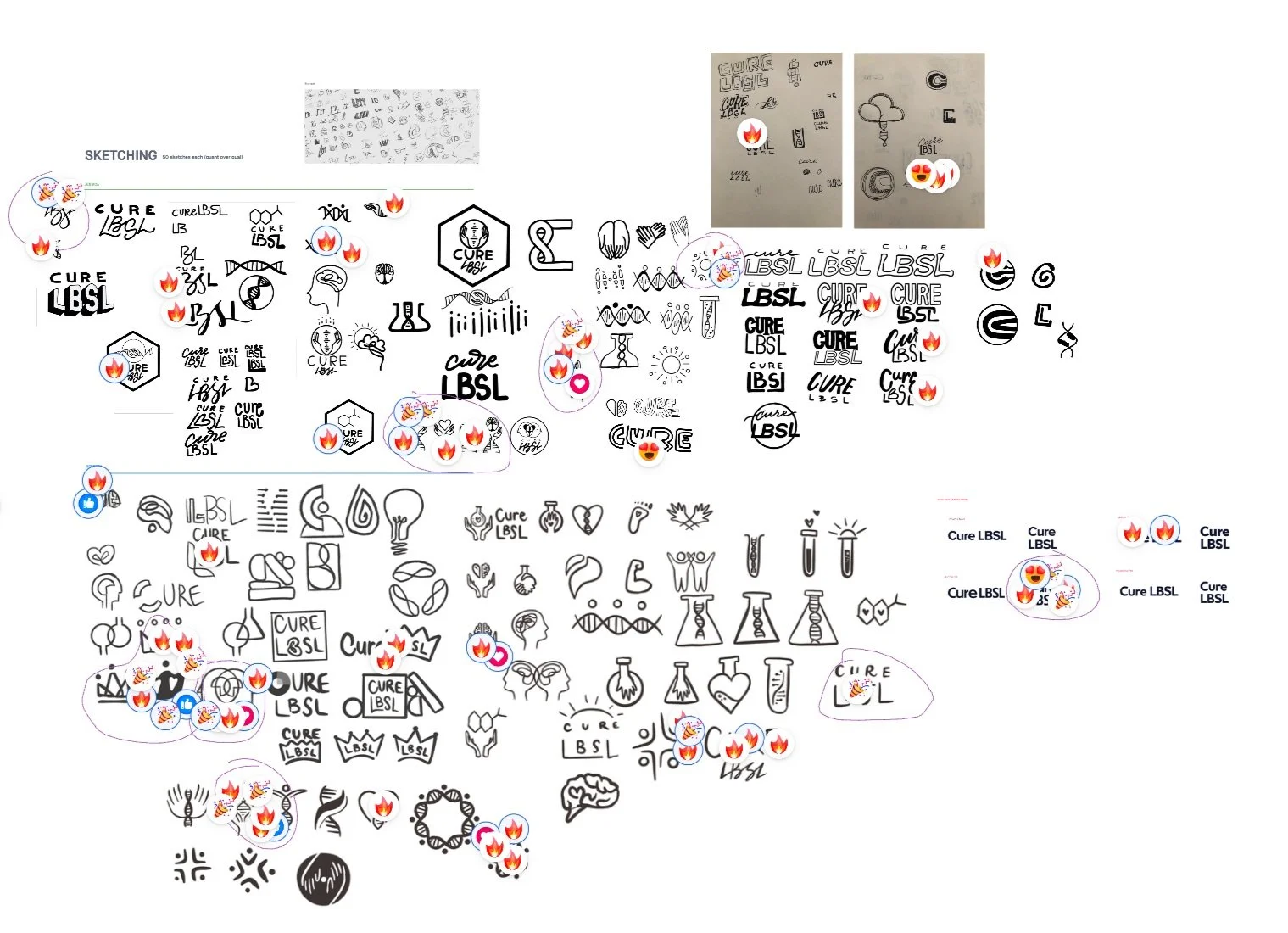
Sketches
From the mind map, we gained a clear idea of the brand identity that we were trying to achieve. The next step was sketching out as many different logo ideas as we could think of. From there, our internal team voted on the logos that they liked best and ideas they thought we should refine.
Presentation to the Client
We refined our designs and concepts and came up with 3 that we wanted to present to our client.
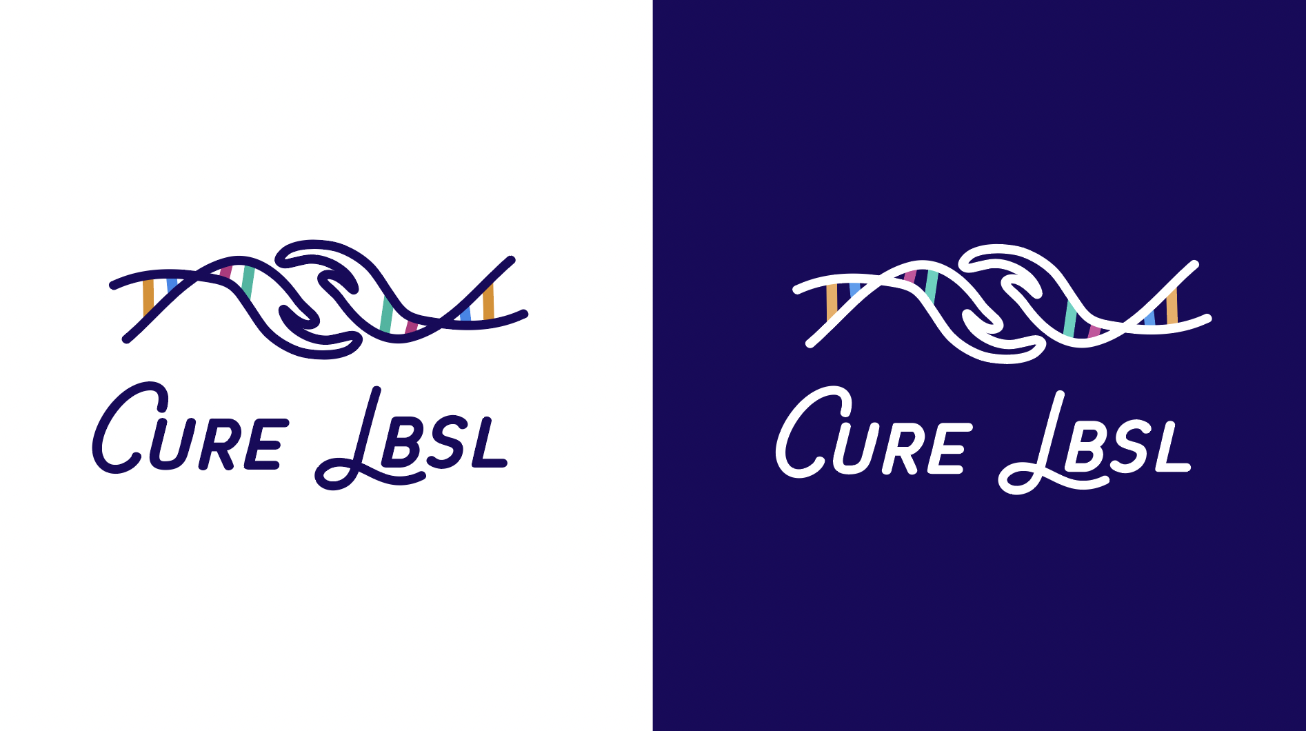
The first idea was hands reaching out to one another with DNA strands shooting out behind. This was supposed to symbolize togetherness and hope along with the scientific research that was being done to combat LBSL.
The second was a simple, but impactful design that symbolized the research efforts of the organization.
The third design was purely a typeface logo. The imperfect lines gave it a fun and youthful quality while remaining professional. Also, every line has a companion symbolizing community and inclusivity.
Final Design
The client chose the first logo concept. We refined the logo further by simplifying the hands and using a thicker line width. We also changed the typeface to one that was more custom and flowed better with the design.
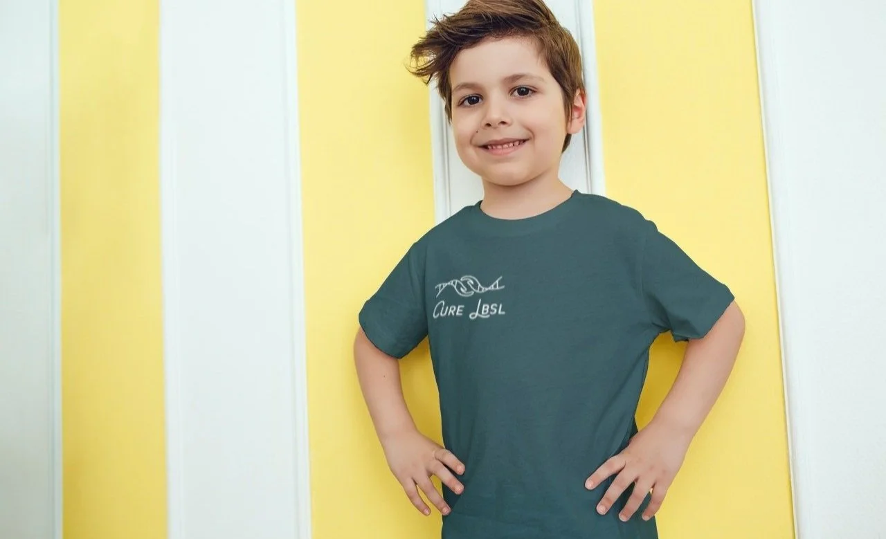
Logo Mockups
Cure LBSL Launched Website
Results and Impact
The results and impact due to the transformation of Cure LBSL's digital presence and brand identity:
Increased Reach: The SEO strategy resulted in higher website visibility, allowing Cure LBSL to reach and support more families and individuals affected by LBSL.
Enhanced User Experience: The revamped website received positive feedback from users, who found it more user-friendly and informative.
Improved Engagement: Streamlined navigation pathways facilitated increased engagement and a smoother donation process.
Stronger Community: The rebranding and renewed website reflected Cure LBSL's expanded mission, fostering a stronger sense of community among those affected by LBSL.
Increased Donations: Transparency about donation utilization and the organization's impact led to increased donations, generating over $200,000 in contributions and another $600,000 secured through the Chan Zuckerberg Initiative Grant.
The rebranding of "A Cure for Ellie" into "Cure LBSL" and the website redesign were transformative steps for the organization. It not only aligned the brand with its evolved mission but also enhanced user engagement, accessibility, and support for those affected by LBSL. This project is a testament to the power of effective branding and user-centric web design in advancing a nonprofit's mission and impact.


