
IRS:
In-App Notification Iterative Updates
About the Project
This case study explores iterative updates of the in-app notification card within the IRS OLA (Online Account) application. The research, design concepts, and findings from these updates will eventually used for the reimagined MVP+ version of the notification section.
I was asked to enhance the visibility and hierarchy of this crucial section within the user interface. This iteration placed emphasis on notification groupings, the integration of icons, and the implementation of indicators, all while drawing inspiration from industry standards and feedback from previous user testing.
Objective
Problem
Deliverables
Role
Enhanced Visibility: Improve the visibility of notifications to ensure users do not miss critical updates.
Improved Hierarchy: Establish a clear hierarchy within the notification card, allowing users to prioritize their actions.
Consistency: Align the design with industry standards as well as remain cohesive with the IRS design guide to reduce cognitive load for users.
Efficient Communication: Ensure that the notifications are concise yet informative.
The in-app notification card plays a pivotal role in the IRS application, ensuring users receive important updates and alerts about their tax matters. The challenge was to refine this feature, making it more user-friendly, informative, and aligned with industry best practices.
Research analysis from previous testing, comparative analysis, exploration of design concepts (inclusion of notification groupings, icons, and indicators), mockups, and user testing.
UX Designer
Research and Analysis
Feature Goal
For OLA users who need to be informed of recent changes to their account or educate taxpayers about available features they have not yet engaged with. OLA In-App Notifications is a personalized communication tool that alerts users to recent updates including new digital notices and letters, recent transactions, authorizations waiting to be signed, profile changes, and new OLA features and releases.
Best Practices
Before we look at industry standards it is important to define notifications and understand best practices.
"Must contribute to an experience that helps people accomplish a goal." - UX Collective
"The system should always keep users informed about what is going on, through appropriate feedback within a reasonable time." - NN/g
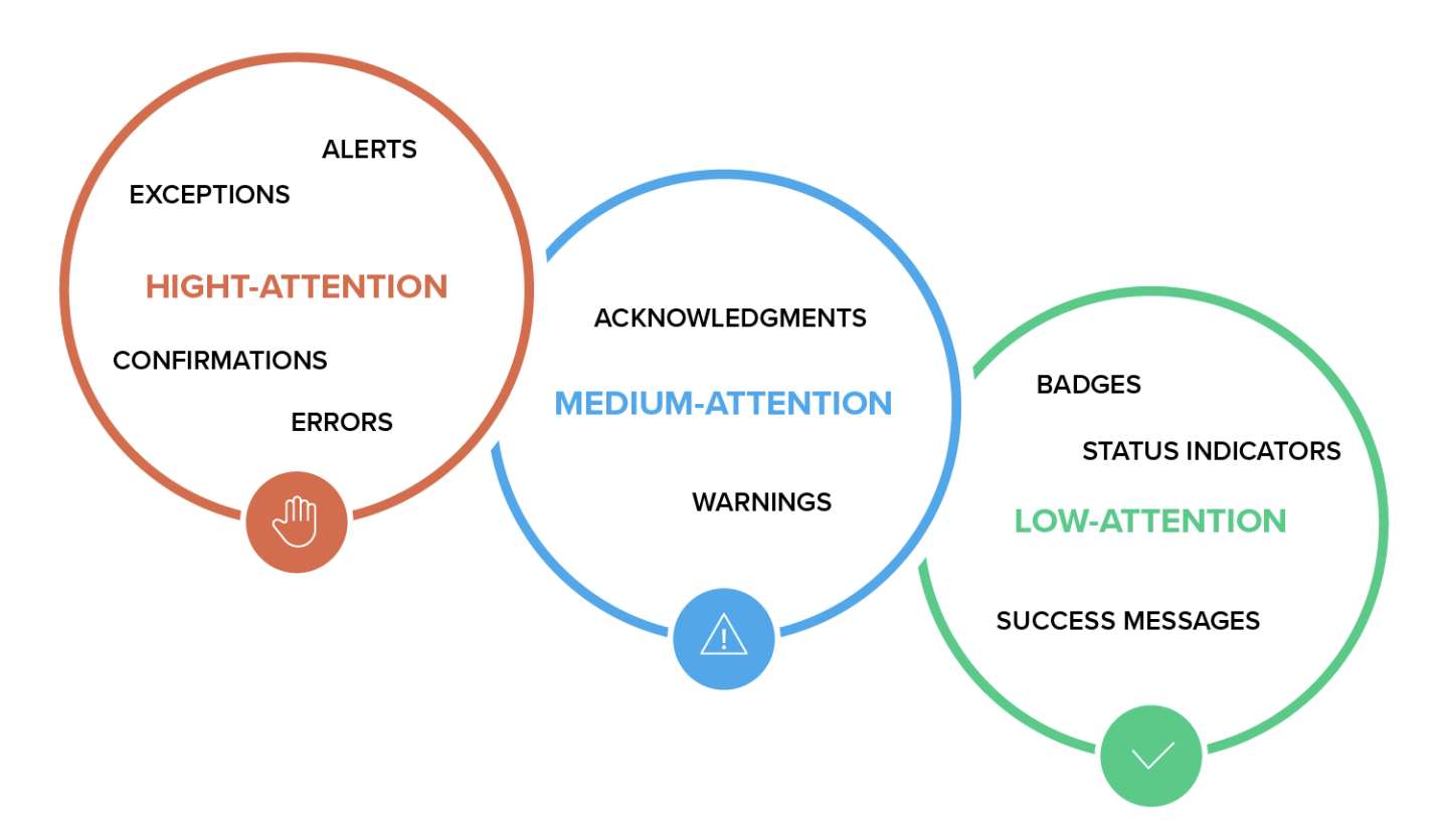
"The initial approach to notification design needs classification on three levels: high, medium, and low-attention, i.e., “levels of severity.” Following that, notification types need to be further defined by specific attributes on those three levels, whether they are alerts, warnings, confirmations, errors, success messages, or status indicators." - Toptal
Current IRS In-App Notification card


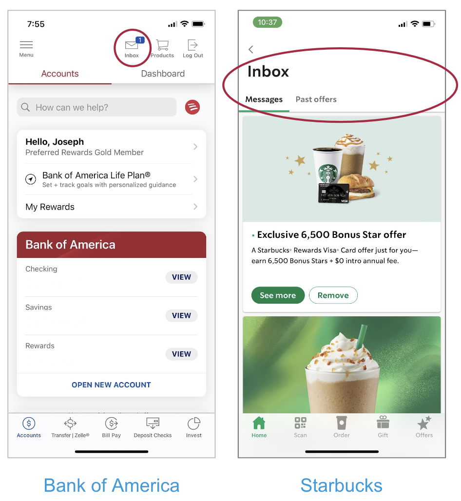
Notifications Like an Email Inbox
Notifications are often treated like an inbox for messaging.
This allows users to view and manage content like an email in their inbox, with familiar conventions. (i.e. read, unread, marked as read, archived)
Notifications are generally action-driven. By opening a message, users can be taken directly to the location to which the notification is referencing to complete an action.
This also gives a feeling of control to users who have the freedom to manage their own messages, while housing notifications in one central location in the app.
Applicable Components
Common Components Associated with Notifications
Status Badges (Numbers, Dots)
Banners
Alerts
Icons
Use of color
Typography (font weights)
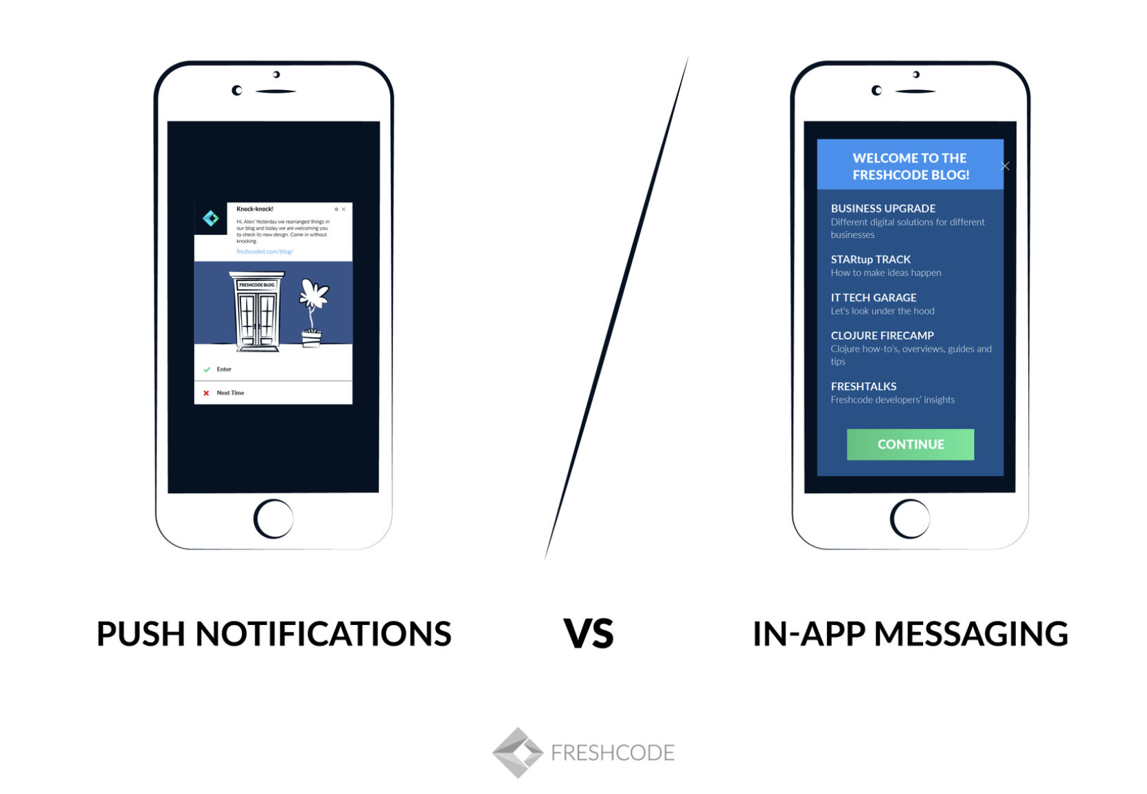
Delivery of Application Notifications
We wanted to take a look at the different ways that notifications can be displayed and the circumstances in which they would be used.
In-App Notifications
Works inside the application
Guides the user in the application
For an active audience
Works only when the app is open
Web Browser Push Notifications
Works outside the application
Brings the inactive user back
For a disengaged audience
Works anytime
Notification Types
For context, it was important to define the different types of notifications to understand the different alerts a user would receive.
Global or Contextual
Applying to the whole system, or to a specific UI element
Action Required or Passive
Alerting the user that an event requires user action, or reporting information about the system
System Event or User Event
The event was triggered by the system or by something the user did
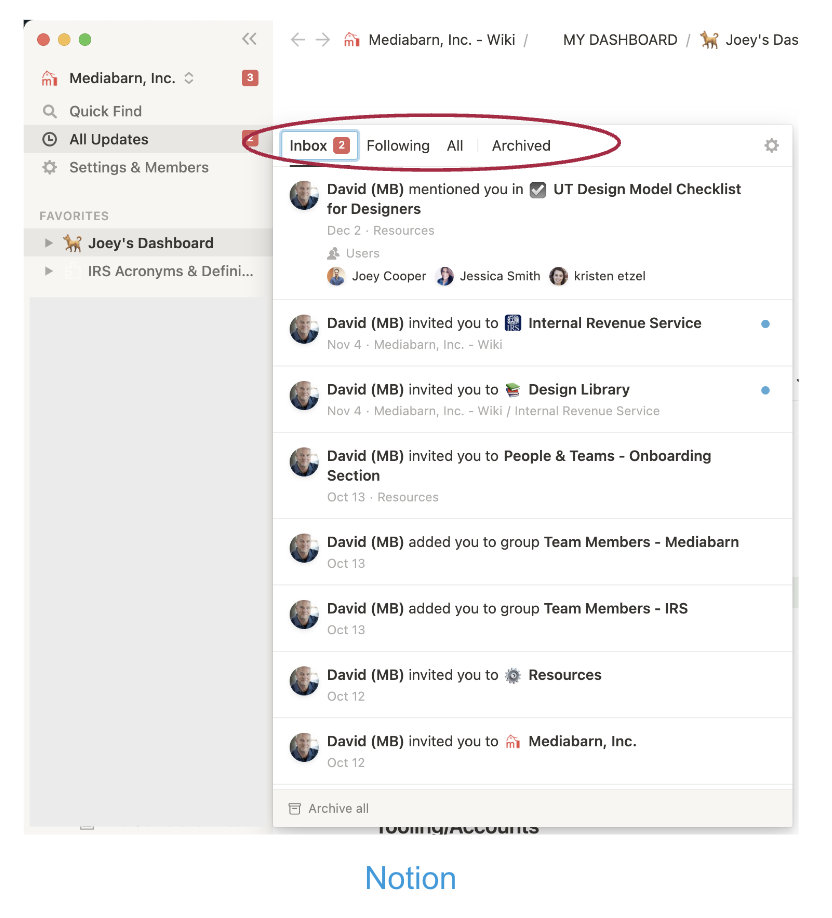
Sectioning or Grouping Notifications
Tabs can be used to group content by status, preference, or all.
This is especially beneficial if a user can expect a lot of notifications, and can be helpful to users if there are ways to reduce complexity automatically.

Next Steps
User testing to discover user pain points with the current card.
Take into consideration the concepts discovered in this comparative analysis for the next iteration of the in-app notification box such as grouping notifications, icons, and indicators.
Use research, testing, and updates to refine and define the MVP+ version of the notification center.

User Feedback Integration
Previous user testing on the In-App Notifications box on the Online Account Homepage demonstrated that there was no sense of immediacy for participants when presented with the notifications box because it is unclear what information is important to view and what is not.
Exploration of Concepts
After the comparative analysis and discussions with the product/business teams, I got to work exploring different designs. Our design system along with archived user research was used to make informed design decisions. The team decided that we would focus on:
Notification groupings
The use of iconography
The use of indicators
Placement of the ‘Go Paperless’ notification
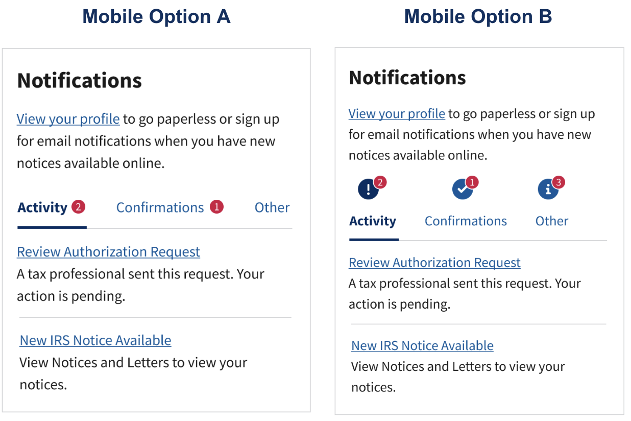
After exploring many concepts, presenting them to the team, and refining the designs. We agreed on 2 that would be tested.


In-App Notification A / B Test Model
Testing Results
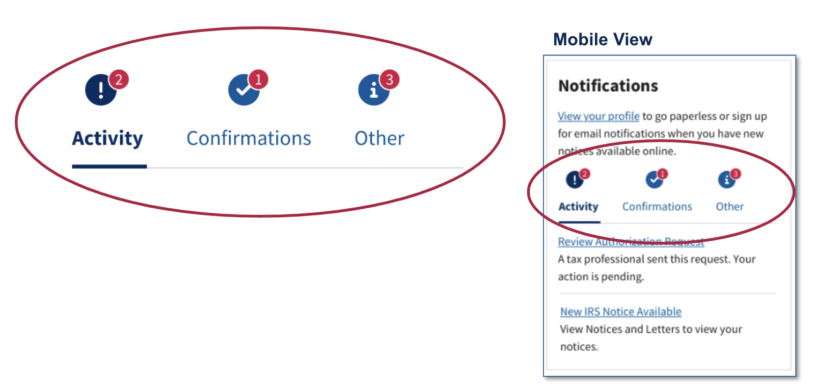
Red Dot Indicators
All participants liked and appreciated the red dot indicators.
Mobile participants did not immediately see the red indicator for the Other tab for Option A.
Users associated the red indicators with new/unread notifications. Their purpose was to indicate how many notifications are in each tab, not new notifications.
There is a disconnect between the users’ understanding and the intended purpose of the indicators.
Header Content
The ‘Go Paperless’ notification was originally placed under the ‘Other’ tab. Business Owners wanted to make sure that this notification was especially visible. We decided to pull it from the tab section and place it on top, below the Notifications header.
Over 80% of participants exhibited some level of banner blindness to this content. Most said they noticed it but didn’t read or give it much thought.
Participants were mainly drawn to the red indicators and did not immediately notice or comment on the notice to go paperless.
Only two participants immediately noticed and commented on the notice to go paperless:
One indicated that this is an option to view your profile or see your notifications.
Another noted that this was simply a reminder.
Other participants who commented after they were asked about it said:
“I don’t think it should be in the notifications box.”
“It is helpful to have it there as a reminder.”
“I would place the content above notifications because it is not really a notification. Viewing profile has nothing to do with notifications.”
“It appears to be slapped up there. It might look better under one of the tabs so it looks consistent.”
Tab Lable Meaning
11 of 12 participants indicated the items in the Activity tab were the most important and required immediate action.
Activity:
Current activity.
Something you need to act on.
Confirmations:
An action has been completed.
Something that was potentially authorized.
Other:
General things.
Things that don’t require any action.
Basic information.
Administrative tasks.
Miscellaneous things like “IRS website undergoing maintenance.”
“Activity is saying something is going on with my account. Confirmations, wants me to view my authorization requests. Other, no notification there, so I’m assuming other stuff that might not have notifications.”
Icons
There was an overwhelmingly positive reaction to and preference for the icons.
Icons are clearer, more helpful, stands out, and draws users in.
The icon further explains what it is.
Icons are a little more meaningful.
Icons jump out more than words.
General interpretations of the icons
Explanation mark icon:
Indicates priority
Needs attention.
Check icon:
Things that are completed
Good
Circled “ i ” icon:
Information


Challenges and Iterative Changes
After we reviewed the testing results, there were some challenges that came to our attention.
We learned that while there are plans for more notifications will soon be added, right now the most notifications that will be shown on a dashboard is 4, although there are 7 total.
Because there are so few notifications being shown the use of tabs to group notifications does not make sense.
We had to come up with a quick solution so we could push the designs out to the developers on time.
I went back to our original design and made some small, but impactful changes based on this round of user testing.
We pulled the ‘Go Paperless’ notification from the top of the section back into where the other notifications lived.
Because the icons tested so well, I wanted to make sure that they were still included in the design. Instead of using them as tab icons, they would instead be used beside each notification to show the type the user is receiving.
We added the ‘Read more’ / ‘Read less’ feature if there are more than 3 notifications in the card with a red dot indicator indicating that there are more notifications to read.
Results and Impact
Conclusion
1. Improved Visibility: Users reported increased awareness of notifications, leading to a reduced chance of missing important updates.
2. Clear Hierarchy: The grouping mechanism allowed users to quickly identify the priority of each notification, leading to more organized action.
3. Consistency with Industry Standards: By integrating familiar iconography and indicators, the IRS application aligned with industry best practices.
4. Efficient Communication: Users appreciated the concise yet informative nature of the notifications, reducing cognitive load.
The iterative updates of the in-app notification card within the IRS application have significantly elevated the user experience. By adopting a user-centric approach and drawing inspiration from industry standards, we were able to enhance visibility, establish a clear hierarchy, and improve user satisfaction. These updates underscore the value of iterative design in responding to user feedback and ensuring that critical user interface elements align with user expectations and industry norms.
< Previous Project