

IRS: Email Template Design
About the Project
As an agency, we need to have a comprehensive email strategy that includes but is not limited to, OLA (Online Account), which standardizes how we communicate with the public, fostering a sense of trust and security when they use our services.
I was tasked with creating a single email template to be sent for all OLA email scenarios to keep emails generic and simplify the approval process.
Objective
Problem
Deliverables
Role
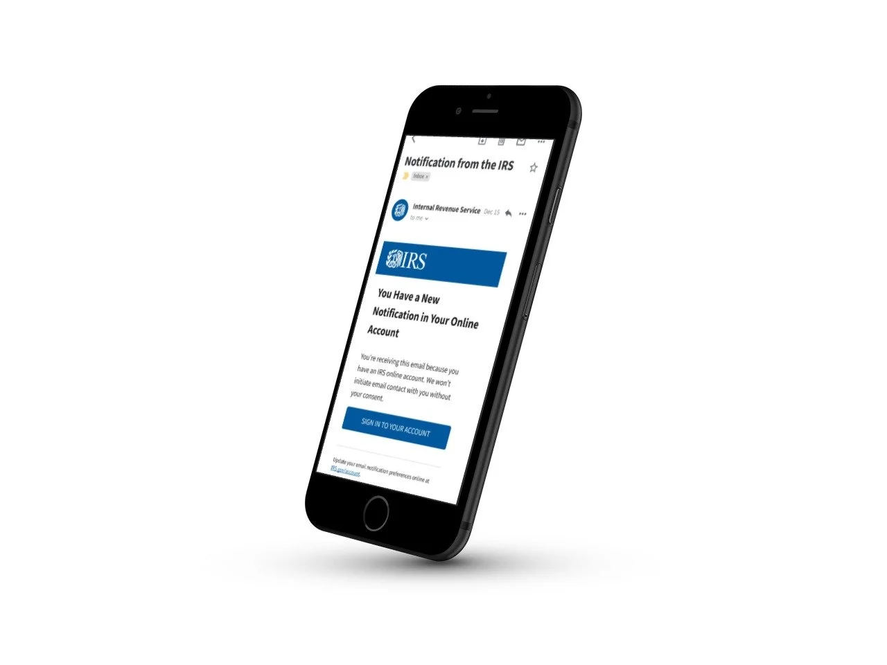
When taxpayers receive an email from the IRS, they expect that email to have consistent messaging and look and feel, regardless of the product or feature that email may originate from. This consistency lends itself to improving trust and compliance. A single email template is to be created to keep messaging consistent and simplify the approval process with our business and IT partners.
During user testing, taxpayers expressed their concerns about clicking a link provided in the email due to fears about potential fraud, scams, and phishing.
Research analysis from previous testing and designs, comparative analysis, exploration of design concepts (buttons vs. links), mockups, user testing, and a journey map to determine opportunities for improvement.
UX Designer
Constraints and Guidelines
Initially, the IRS utilized three distinct email notification types: call-to-action, outreach, and transaction or confirmation, each employing language tailored to its purpose. However, as we talked with our business and IT partners, a critical discovery emerged. Changes in the Privacy, Governmental Liaison, and Disclosure (PGLD) guidelines had taken place. These guidelines are key as they govern the IRS's privacy and records policy and initiatives, orchestrating pivotal actions concerning privacy and records across the entire IRS landscape.
These guidelines dictate that no personal information can be disclosed in these emails. The information also needs to be very broad making approval of copy tedious. In pursuit of simplifying this approval process and ensuring consistency, a strategic decision was made to implement a single, versatile email template for all OLA communications.
The challenge here would be providing enough information to the users so they feel secure receiving this email while also keeping it generic.
User Feedback

I created a first draft of the generic template and was able to complete a round of user testing. Testing demonstrated that taxpayers may not click on the links in the email because they fear hackers and want to avoid fraud.
Research Questions:
Should we remove the link? If so, should we do the same with the Footer?
Consequence: We cannot gather data.
Should we include an option to copy and paste the URL?
Are there any other alternatives?
Additionally, since other individuals apart from taxpayers may receive this email, should we update the salutation? What salutation makes taxpayers feel secure?
Research and Analysis
To address these questions, I undertook research to delve into industry norms and best practices regarding salutations, link presentation, and the inclusion of "Contact Us" footer links. This involved an extensive examination of six email designs sourced from financial institutions.
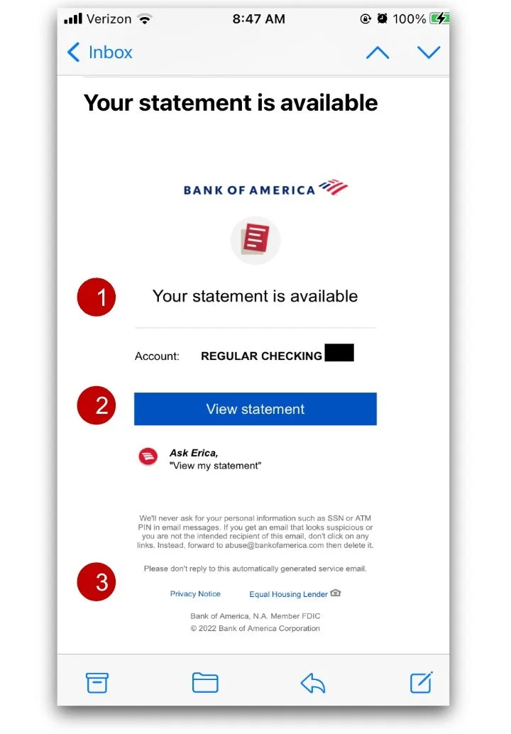


Bank of America
Bank of America provides a concise email to the user when their bank statement is available.
1. Does not use a salutation
States “Your statement is available”
2. Uses a button to link to your account
Gives the user a clear call to action
3. Does not provide a link or a phone number to contact them
JP Morgan Chase
This email was received after updating the address information in the Chase account.
1. Uses a salutation
Addresses the user by name
Also uses a closer
2. Does not contain a link to the online account
Referring to the online account without including a link protects the user’s privacy by allowing taxpayers to access the unique page if they need to take any necessary action
3. Does not provide a link or a phone number to contact them
Instead provides directions to the message center if the user has questions
USAA
This is an email received after a deposit had been submitted.
1. Uses a salutation
Addresses the user by name
Also uses a closer
2. Uses a button to link the user to their account
The use of the button provides a clear call to action
3. Provides a link in the footer to the contact page
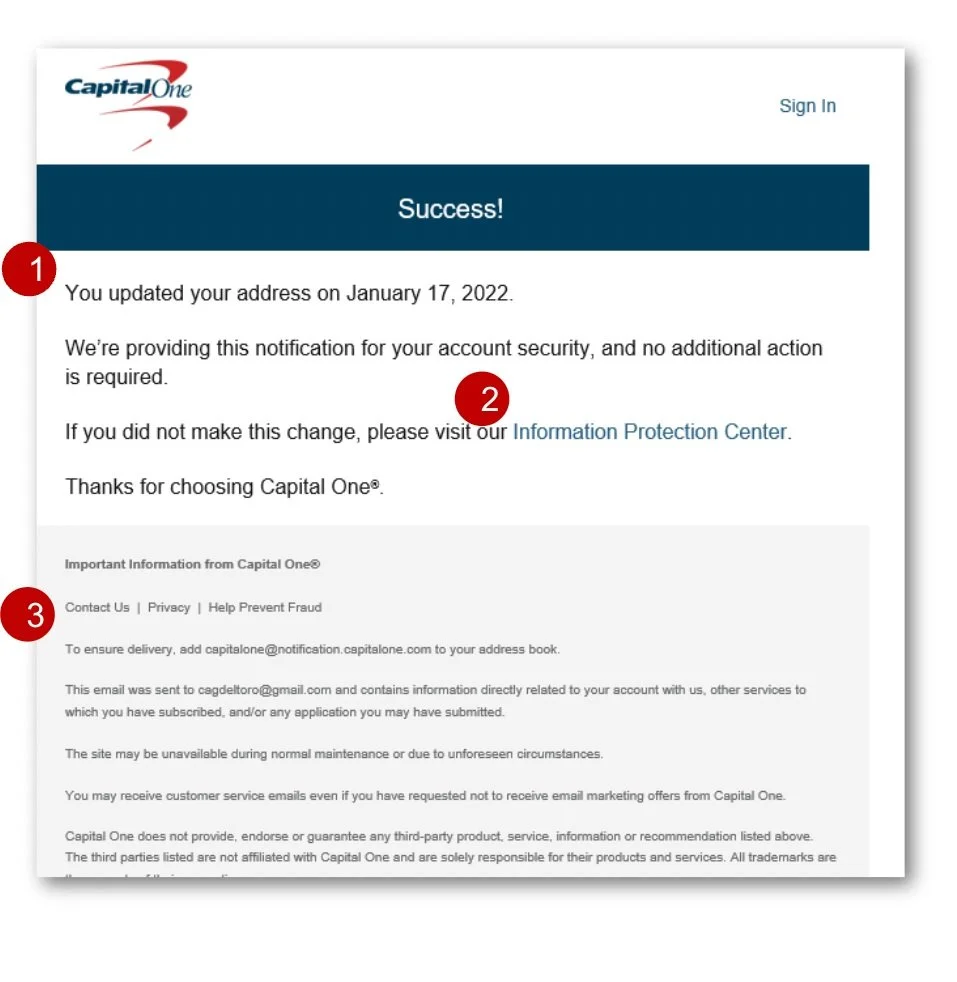
CapitalOne
This is an email received after updating the address information in the Capital One account.
1. Does not use a salutation
2. Does not contain a link to the online account
However, it does include other links
The links provided allow the user to know where they can take necessary action
3. Provides link to the contact information in the footer
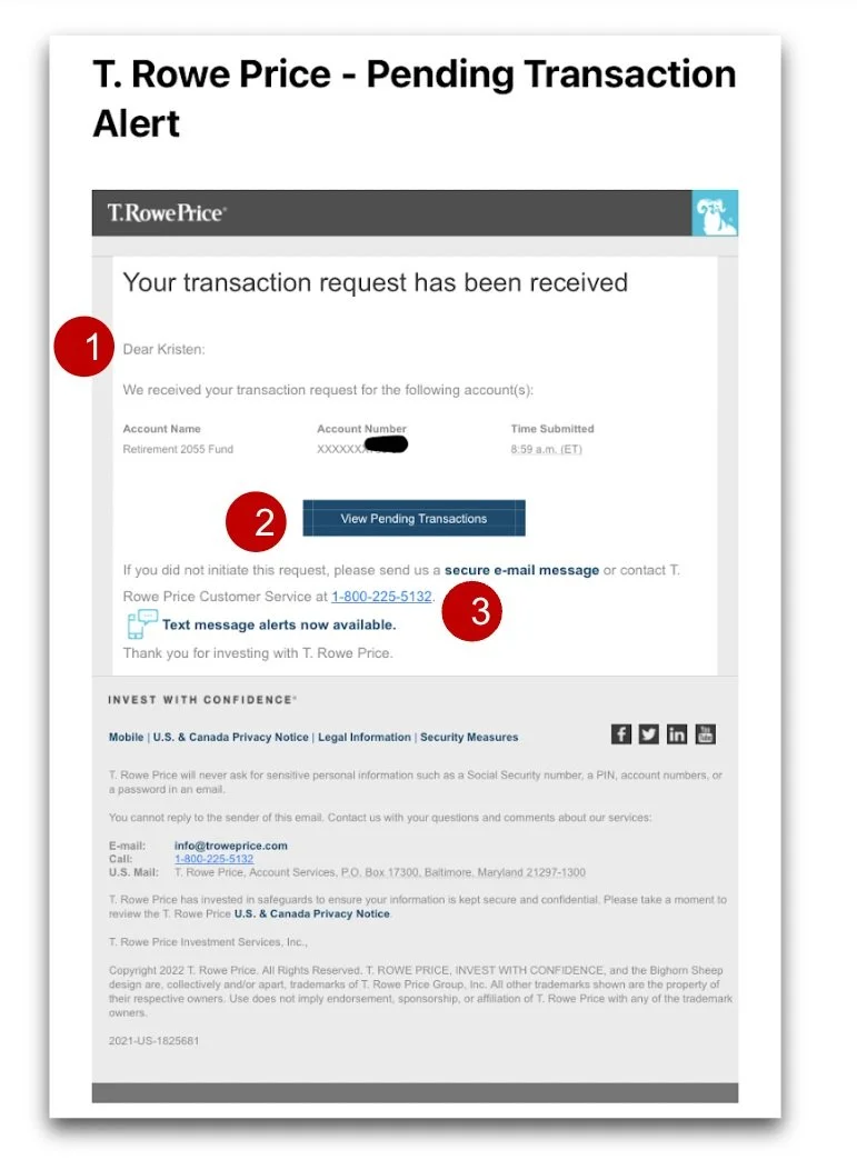
T. Rowe Price
This is an email received after the user had made a transaction request.
1. Uses a salutation
Addresses the user by name
2. Uses a button to link the user to their account
The use of the button provides a clear call to action
3. Provides a phone number to the user for assistance
Phone number is provided in the secondary copy of the email as well as in the footer
Vanguard
This is an email received after a transaction has been made.
1. Uses a salutation
Addresses the user by name
2. Does contain a link to their homepage
They also provide directions to its users to sign into their account and where to find the necessary information
3. Contact link provided in the secondary content of the email
Buttons vs. Links
Upon conducting a comparative analysis, it became evident that the utilization of buttons and links conveyed distinct user intents. Buttons and links serve contrasting functions:
A button signifies an action that will alter the website's state, whether on the front or back end
A link directs users to a different location without affecting the website's state.
In essence, a button initiates an action, whereas a link leads to a different destination. With the copy constraints provided by PGLD, buttons and links could provide important context or indicators to our users.
This led us to some interesting questions:
Can we effectively change out buttons and links in emails to clearly communicate the required user actions?
Will users understand the context that we are trying to offer them and notice the difference?

Recommendations
Either use personal salutations or don’t use them at all. Because PGLD prohibits using personal information, my recommendation is to exclude the salutation.
Exploration around whether users understand the context that buttons or links provide (i.e. if an email notification is indicating an action item or just information for the user to view).
The Contact Us link is pretty standard in the industry so we should consider keeping it as is.

Design Changes and Testing Results
Updates
Based on the previous testing and comparative analysis, I made a few updates to the email template design. These designs would be tested in our upcoming round of user interviews.
The first change that was made was to remove the salutation. We did this for a couple of reasons. First, because there is no closer the the body text, the salutation didn’t serve much of a purpose. Second, we can not personalize the salutation, and the previous salutation of “dear taxpayer” sounded cold and impersonal.
The next update was in the body copy. I worked with our content specialist to create copy that uses very plain language that any of our users can understand.
Finally, we wanted to see how users would react to the button or link being used as the main call to action. An A/B test would be done to get more insight into how the users view these in relation to the action that needs to be completed.
A/B Testing
We conducted user interviews to find out more about their perceptions of links and buttons as well as if they found that these emails looked trustworthy.
Participants understood the general idea and elements of the email.
Participants are clear on who the email is coming from and what it is asking them to do.
Although security is a concern, taxpayers are willing to be slightly inconvenienced in order to ensure digital communications with the IRS are secure.
Taxpayers want their digital communications and transactions with the IRS to function the same way as with other financial institutions and to be equally secure.
“It’s exactly what I would expect. I like that they don’t share the info and tell me to go on their website to do that..”
Participants overwhelmingly preferred Option B.
Taxpayers found that it appeared a little more “official.”
Participants found that the blue button draws you in and is a more visible call to action.
80% of participants immediately noticed the difference between the two versions of the email.

Option A
Option B

Challenges
Following user testing, it became evident that the email template featuring a button was preferred by users due to its clear call to action and official appearance. However, discussions with our business and IT partners revealed past issues associated with buttons in emails, particularly with Outlook users.
Extensive consultations involving developers, business stakeholders, and 508 compliance teams were held, leading to the conclusion that the button posed compatibility challenges for a significant portion of Outlook users. Regrettably, we needed to reevaluate our approach.
Our recommended solution involved ongoing efforts to resolve the coding issues related to the button, ensuring its potential use in the future. In the interim, we devised an alternative approach to meet our email template deployment timeline. We introduced a subtle yet impactful change to the template containing the link. While retaining the approved copy, we replaced the button with a bolded link. This adjustment maintained a clear call to action while circumventing the compatibility issues associated with buttons in Outlook.

Final Design
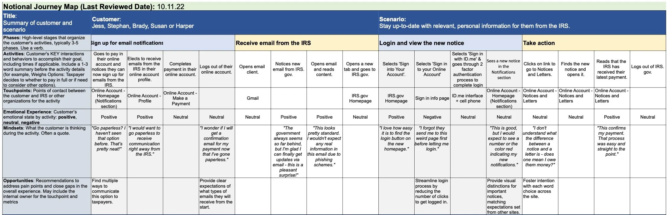
Journey Mapping
I collaborated closely with the research team to craft a comprehensive journey map for this project. The objective was to provide a visual representation of the user experience, enabling us to pinpoint pain points and uncover valuable opportunities for enhancing the email communication process. This endeavor was particularly important as it interconnects with various elements of the OLA homepage, underscoring its broader impact.
This journey map was a strategic tool that helped us visualize the user experience, take a deeper look into the intricacies of email interactions, and make informed decisions about how to enhance this critical aspect of the IRS's communication strategy. It ensured that our design solutions were not only user-centered but also harmonized seamlessly with the larger OLA ecosystem.
Results and Impact
Conclusion
The solution involved the creation of a single email template that adhered to the IRS design system while addressing user concerns. It emphasized the use of buttons over links to enhance the clarity of calls to action and reduce the perceived risk associated with clicking on links.
The new email template significantly improved trust and engagement among taxpayers. By adopting a consistent design and messaging approach, the IRS successfully reassured taxpayers about the legitimacy of their emails. Early metrics indicated increased click-through rates and a reduction in user apprehension.
The design adhered to the Privacy, Governmental Liaison, and Disclosure (PGLD) guidelines, ensuring that no personal information was disclosed and precise wording was used. Additionally, the design complied with 508 accessibility standards to ensure a broad reach and usability for all taxpayers.
Through a user-centered design approach, the IRS successfully addressed the challenge of creating a unified email template for OLA communications. By prioritizing consistency, clarity, and security, the IRS not only improved trust but also enhanced the taxpayer experience in a digital age where email communication has become essential.
This project demonstrates the IRS's commitment to adapting to changing technology while maintaining its core values of security and trust in all interactions with the public.