

Mentor Buddies
About the client:
Design Buddies is an inclusive community of designers from all around the world. While Design Buddies is a great place to get advice and feedback from peers; there is a growing demand for members to find expert mentors "on-demand" to get specific answers to their questions. This is where Mentor Buddies comes in. Mentor Buddies is a mobile app where members can find a design expert to chat with privately for about 15 minutes, in exchange for a small donation to the charity that the mentor has chosen.
Objective
Problem
The goal of this project is to overhaul the Mentor Buddies onboarding experience and optimize it for a higher customer adoption rate. By analyzing user behavior, we aimed to identify the specific points where users tend to drop off and make strategic changes accordingly.
How might we design an onboarding experience that encourages new users to start their first mentor session?
Deliverables
Stakeholder interview, application analytic evaluation, usability testing, onboarding redesign
Role
UX Designer
Interview Buddies
We wanted to learn more about the current solution, and some of the things that were working (and not working) in the Mentor Buddies beta launch.
We interviewed Founder Grace Ling to learn more about where to focus our efforts Interview Findings:
Goals:
Increase conversion rate
Get more people to sign up for their first session
Find out why people are not signing up
What’s working:
The feeling of community
Users feel like they are gaining valuable experiences
Users are getting answers to non-Googleable questions
Enjoyment of sessions
What needs improvement:
There are too many choices for the users
Lack of personalization to matching with mentors
Constraints:
Must be a mobile app
Focus on the onboarding flow
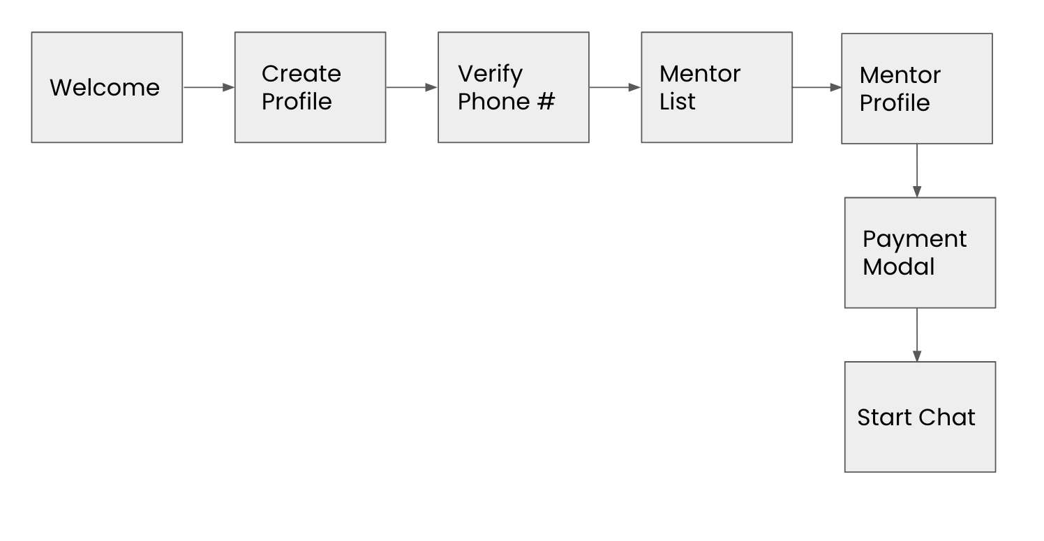
Must sign up, verify their phone number, and donate before starting a chat
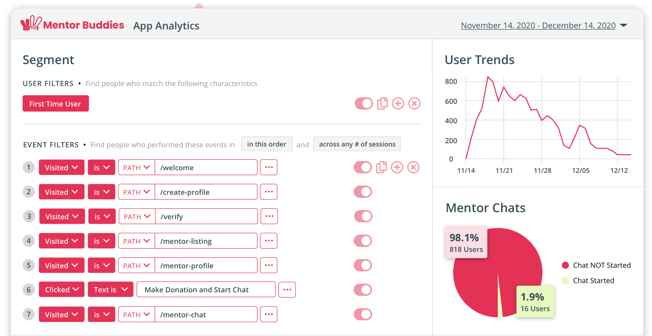
Application Analytics
Next, we turned to the analytics gathered from the beta test to see if we could draw any conclusions from the patterns and trends of the users. We saw that there were significantly more people who started the process than those who made it to the end of the process. We wanted to when those drop-offs were occurring and why. We looked at the amount of time users were spending on each task and their success rate.
Possible Points of Friction
Create Profile Page
On the Create Profile page, a concerning drop-off rate was observed among users. Out of a total of 542 sessions, a significant number of 358 users abandoned the process, while only 184 users successfully completed this step.
By analyzing the reasons behind this high drop-off rate, we can identify opportunities for improvement and enhance user engagement.

Mentor List Page
There were a few indicators of friction on this page. The first was the amount of time that users were spending on this page was high with an average of almost 6 minutes. Second, there was a lot of clicking around on this page. Lastly, we noticed that there were very few clicks on the search bar.

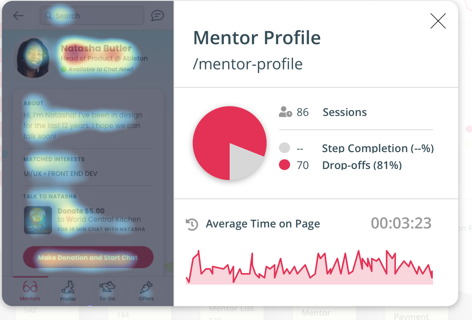
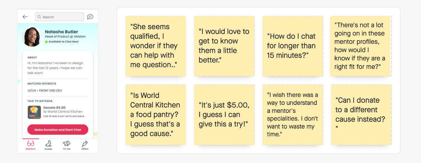
Mentor Profile Page
The drop-off rate was high on the Menor Profile page; about 70% of users dropped off at this point. We also saw fewer clicks on the payment modal.
Understanding “Why”
User Insights
Based on the low adoption rate, we identified a few possible points of friction in the onboarding process. We wanted to understand the reasons why these points of friction were occurring. Through usability tests, we were able to gain a better understanding of user pain points and insight into the problem to create a solution to fit the users' needs.
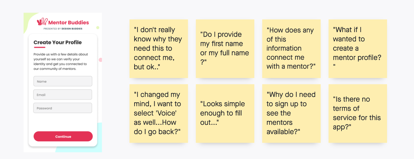
Create Profile
Users want to see the mentors before signing up
There was no option for if you wanted to sign up as a mentor
No back button
“Why do I need to sign up to see the mentors available?”
Mentor List
There are too many choices; it's overwhelming
The user is not sure what to search for
Wants to filter by a charity
Users are confused by UI; it's unclear how to start a chat
“This is starting to feel overwhelming...did all of these mentors match with me?”

Mentor Profile
A lot is going on; unsure how to match with the right mentor
Better matching system or communication about how the users are matched with mentors
“I wish there was a way to understand a mentor's specialties. I don't want to waste my time.”
Mapping
Out Flows
Updated Flow

After carefully analyzing user feedback and examining the high drop-off rate on our Create Profile page, it became clear that our users desired a change in the flow. In response to this valuable feedback, we decided to revamp the user experience and give users the option to skip creating their profile and proceed directly to viewing the mentors they have been matched with.
Understanding that users wanted to see the mentors before committing to the sign-up process, we took their needs into serious consideration. By providing the option to skip profile creation, users can make an informed decision about whether our platform's mentors align with their goals and expectations.
Original Flow
Changes and Improvements
Introduction and Splash Pages
In our user testing, we found that there was some confusion when starting the onboarding process. For this reason, we decided to explain how the app works upfront and added an introduction page.
Feedback indicated that there was interest in users signing up to be mentors, but no way to do that. We added options so that the users could choose the correct option for them.

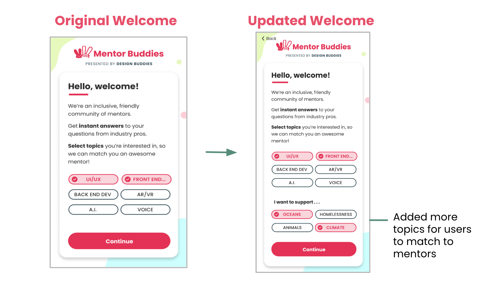
Welcome Page
Sketch of an updated welcome page that includes multiple sections where users can choose their interests.
We discovered that the users were interested in matching with mentors on a more personal level. For this reason, we added more categories.
We added causes that the users would be interested in as a way to better connect with a mentor.

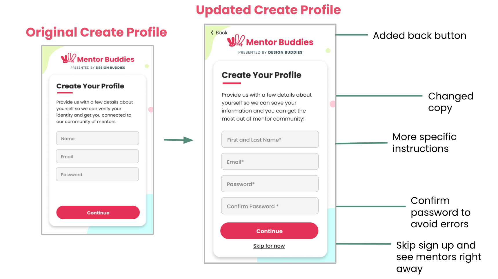
Create Profile Page
A back button was added based on user feedback.
We changed the copy to feel a little lighter because the users were concerned about verifying their identity.
An option to skip creating a profile until after the user has seen the mentors was added.
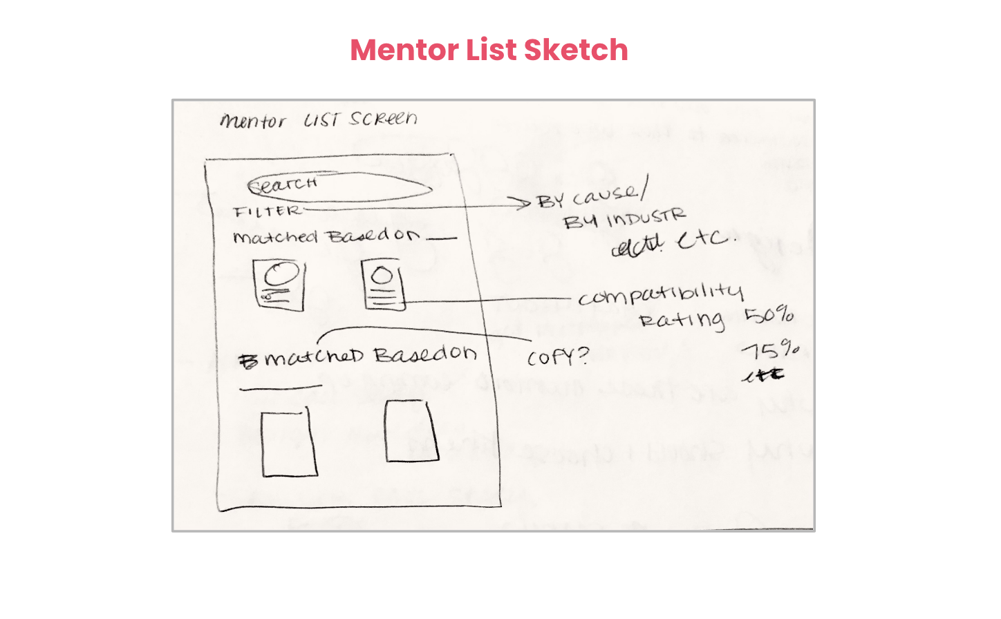
Mentor List Page
A filter was added so users can quickly search through their results and find the best mentor for their needs.
Sections that indicate why the user is matched with each mentor were added.
In our user tests, there was confusion about how to start a chat. Our solution was to replace the arrows with chat bubbles to clarify where to click to start a chat.

Mentor Buddies Prototype

Measuring Success
To measure the overall success of our solution, we would track the following key performance indicators (KPIs):
1. Conversion Rate: We would monitor the rate of conversions happening on different pages of our solution. Specifically, we would focus on the following pages:
Create Profile Page: We want to ensure that a higher rate of conversions is occurring on this page, indicating that more users are successfully creating profiles as mentees.
Mentor List Page: Tracking this page will help us understand if users are successfully finding the right mentors for their goals.
Mentor Profile Page: By monitoring this page, we can evaluate whether users are converting into mentor-mentee relationships or engaging with mentors in a meaningful way.
2. Completion of Mentor Chats: Another important measure of success is the overall completion rate of mentor chats. This metric would help us assess if users are successfully initiating and completing meaningful interactions with mentors. By increasing the overall completion rate of mentor chats, we can ensure that our solution is facilitating effective mentor-mentee relationships and providing value to our users.
By tracking these KPIs, we can gain valuable insights into the performance of our solution and make data-driven decisions to optimize and improve user experiences.